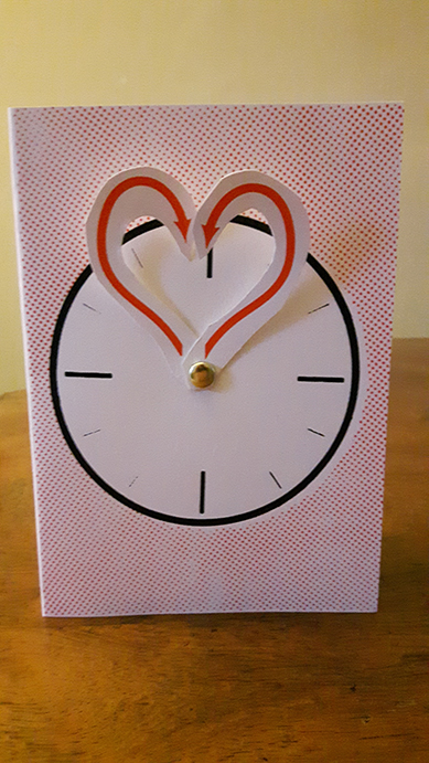
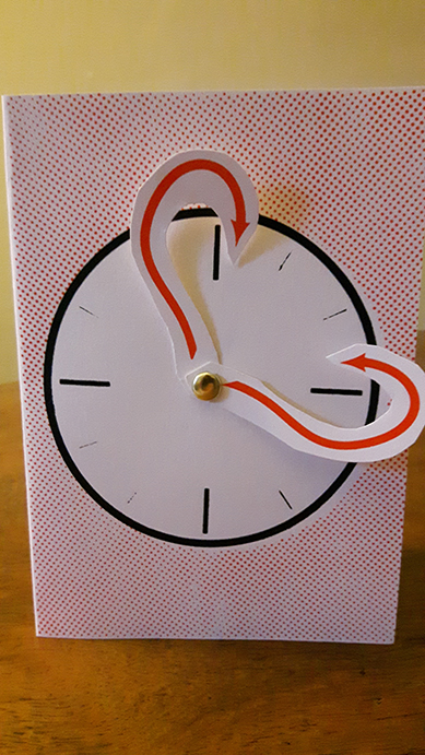
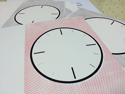
This birthday card accompanied a watch and I wanted to keep with the "time" theme. Mind you, no-one likes being reminded of the passing years, so I went for the message that love is timeless. The hands (also screen printed) rotate around a push-pin to make a heart, while inside features a quote from a musician that we saw live several times this year: Sweet Baboo.
0 Comments
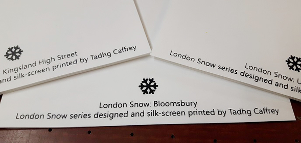 'Tis the season and all that so I've been working on a set of screen printed Christmas cards. I wanted to keep things minimal, and based on areas of London I've become familiar with this year: Upper Street in Islington, Kingsland Highstreet in Dalston and finally, Bloomsbury. Much of my art recently has been focussed on unusual architecture. For these cards, I aimed to represent landmarks from these areas in silhouettes, with some abstract snow flakes drifting upon the rooftops. For example, the Bloomsbury card features the Wilkins Building at University College London, the houses around Bedford Square and the Curzon cinema at the Brunswick Centre: 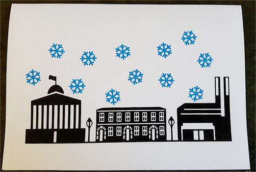 The finer detail, particularly on the houses in this card really pushed the limits of my screen and there was some blue air in the studio as I had initial trouble with ink smudging. Thankfully, with some good advice I rectified the issues (there was a lot of playing around with clamps, vices and screen bed heights) and completed the series on Friday. There are three street designs, each with two editions of different coloured snow flakes. Here's the Bloomsbury card again, this time in red, pre-folded and on the drying rack: 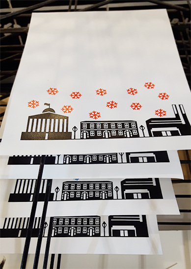 My Upper Street card has a few cafés, Union Chapel and Screen on the Green, while the Kingsland Highstreet card features Ridley Road Market, Kingsland shopping centre and the Rio cinema. Each has the series titled printed on the back.
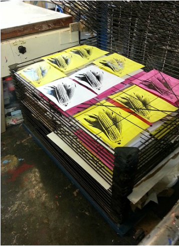
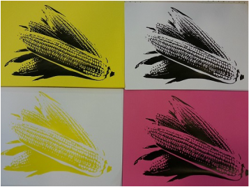
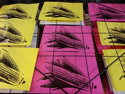
I'm hesitant to throw up lots of pictures of the series because I intend to actually send them to people and don't want to spoil the surprise: but if you insist, use the below slideshow to see the other designs! I'm also looking to sell some of these on the cheap to help cover my costs, so drop me a line if you're interested in a few blank ones. This was a fun print that I worked on a few weeks ago. I wanted something easy and recognisable, and I settled on a one layer print of some ears of corn. There were no grand ideas behind the print, I just wanted to focus on getting my technique right. As it was a one layer, I decided to give it the full space of my 90 thread mesh screen. 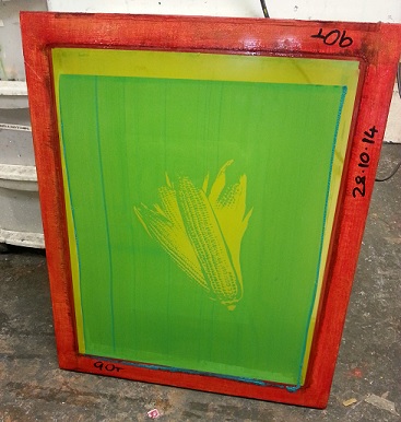 I messed around with a few inks and papers, mostly light weight stock and a few coloured backgrounds to go with it. It was a really simple and satisfying session in the studio, though it had me dying for a snack right after!
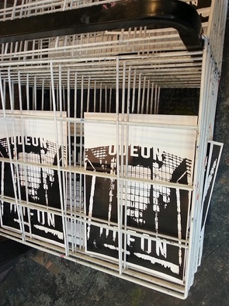
 For the final piece in this series I wanted to connect back to the films shown in the Odeon in Muswell Hill. With a little bit of research I discovered that the first film to show in the venue was "Educated Evans", starring Max Miller and directed by William Beaudine. The film is now unfortunately lost, though as part of their 'Most Wanted' campaign, the BFI have a great article about it.
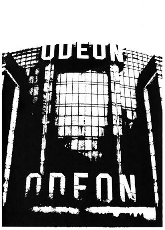
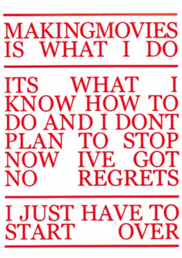
William Beaudine was a fascinating director, renowned as one of the world's most prolific and one who helped to frame the remit of early cinema. If you were a film-goer in at any time between 1920 and 1960, you almost certainly would have seen at least a handful of his 500 works. Poor critical response and derision of his filming techniques however, relegated Beaudine to "B-movies". He was unperturbed by this and showed a dedication to his craft and his love of film by continuing to commit himself to each of his features. The parallels to the Odeon in Muswell Hill's recent fortunes are obvious. I think it fitting that this stalwart director who fell upon hard times yet strived to reinvent himself had his name on the first film shown in the venue, a venue which faces the challenges of contemporary cinemas with optimism. This quote from Beaudine on 120gsm summarises his determination and rounds out the series. The Odeon in Muswell Hill had some pretty unusual design features and I've been trying to distill these features into one print as an abstract homage. I ended up focusing on three of them: The external sign is a classic and I very much wanted to include their blocky font. I also really loved the Art Deco lamps: they've got a sense of movement, forming arrows that point towards the cafe and lobby while emitting muddied, low tone light. Finally, the faulty strip lighting inside the cinema screen area struck me as a good summary of this once vibrant cinema drifting into obscurity. This lighting strip also resembled 35mm film, the mainstay of the pre-digital days. 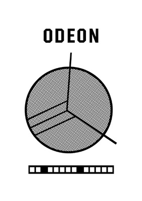 This abstract piece gave me some hassle in printing as I had over-exposed my screen, meaning it was difficult to draw out the detail within the middle lamp. It's not worth posting those test prints but I hope to get back to this piece in the future.
I love a good cinema and particularly those built in the Art Deco style of the early 20th century. So I made it my business to tour a few of these sites during Open House London 2014. The Phoenix Cinema in East Finchley is a classic, but it was the odd, squat Odeon in Muswell Hill that really caught my eye. When I decided to start working on some graphic design and screen prints I returned to some photos I snapped during that visit and put together a short series. It has since been refurbished, but the venue was fairly dilapidated and poorly maintained. A Grade II listed building from 1936, it was clearly struggling to compete with more contemporary cinemas in the area. The venue was still charming in its ageing, a monument to the early days of popular cinema. I wanted to capture some of these thoughts and unique design features in this series. I started with a photograph of the striking facade, using some thresholding techniques to indicate decay. The composition gets lighter at the top, with the iconic sign fading into the permanence of the background.
I printed this on 150 gsm card, though it had a slight texture to it. The print was a good early experiment for me with thresholding and contrasts.
|