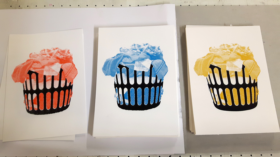
 To go with my launderette series of prints I wanted to do some smaller post cards. These laundry baskets use the same combination of spot colour, vector shapes and half-tones as a contrast. The series comes in red, blue and mustard and is at A6 size. I managed to get some ink on my clothes making these so they were a constant reminder to put a load of washing on!
2 Comments
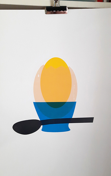 Much of my stuff to date has used colour blocking so this print was a nice chance to try some overlapping. I love the iterative process of screen printing: it's fascinating to create a digital image, separate it into layers and build the image back up again by hand. As you can see in the images below, I started with the yolk, layered on the shell followed by the spoon and finally added the egg cup. 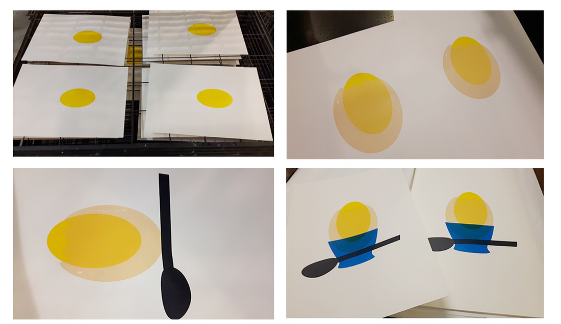 The inks mixed up nicely though next time I'll likely make all of the colours a bit lighter to balance it out. I also had a few issues with an old ghost image knocking out some of the shell colour but I think the mottled effect on the shell adds to the finished piece. It was an EGGsperiment after all!
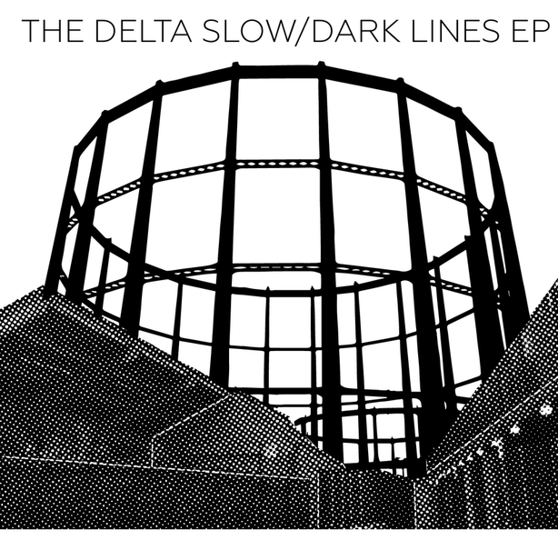 I'm lucky to be friends with the extremely talented Kadie McGinley who rocks absolute socks as part of The Delta Slow. We were looking for a project to collaborate on and their upcoming EP launch was the perfect chance. The record is brilliant and was recorded at Old Paradise Studios in Hoxton. For the artwork, Kadie and me took an evening to explore the area around the studio and take some photographs.
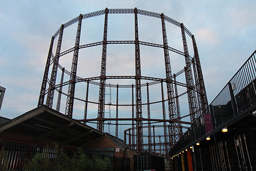
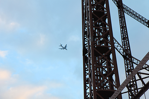
The towering, decaying gas cylinders in the area were inescapable and became the basis for the EP artwork. A few chats over pints and some listening sessions of the music sent me in the direction of the finished artwork. From that point it all came together pretty quickly, as the band and me were almost instantly on the same aesthetic page. Half tones and vectors recur, setting up contrasts while keeping the images in stark black and white. The designs work for laser and screen printing and the band will be putting out copies of both in the next few weeks. I'll follow this up at some point with pics of the screen print session and other bits we created for the EP launch. It's been seriously fantastic collaborating with such exciting musicians on this one: make sure you give them a listen and grab the EP. 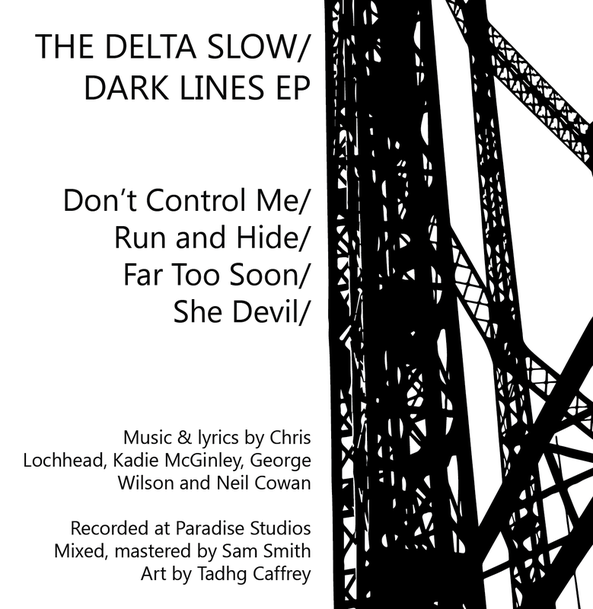 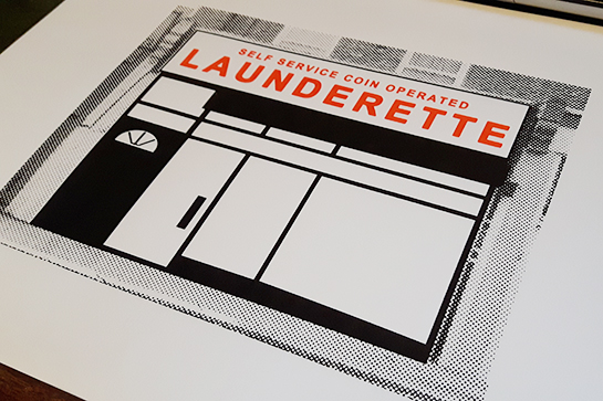 I followed up my first launderette with a neighbouring one on Blackstock Road. As with the previous piece, I'm trying to play around with half tones and block colours in an effort to disrupt the usual way you would view somewhere like a launderette. As they fall into the background of gentrified north London we should pay them more attention before they completely disappear. 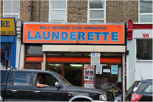 On a whim, I attempted to place these two launderettes next to each other. I didn't use any proper registration to line everything up, but I'm happy with the result of this little experiment. 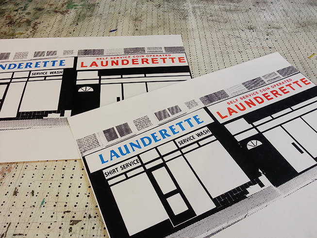 Keep an eye out for part 3 of the series, my next trip to the launderettes of Blackstock Road is in a different direction...
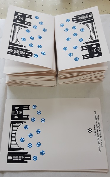
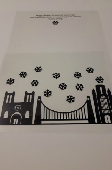
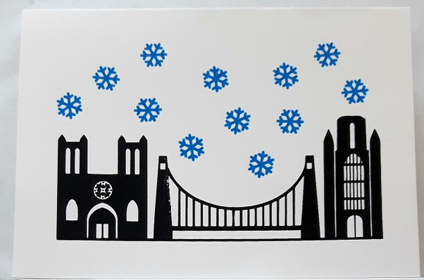 I was happy with how the London Snow Christmas cards came together and off the back of that I had a commission for a Bristol version. This was another fun card to do and I used some nicer, thicker stock for the print. From left to right the card shows the Bristol Cathedral, Clifton Suspension Bridge and Wills Memorial. That's all for the Christmas cards this year but I might look at doing a large poster version in the near future!
 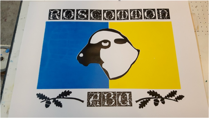 It's my mam's birthday this week so I wanted to send over something a little different! She's a proud Roscommon lady, who has the patience of a saint to ardently follow the fortunes and misfortunes of their Gaelic Football team. For the present I wanted to create a strong visual with Roscommon colours and symbols, including their sheep emblem and oak leaves. "Roscommon Abú" is a combination of Irish and English and means "Roscommon Forever", a typical sporting battle cry in Ireland. The font was adapted from Dieter Steffmann's 'Eileen Caps' and the icons adapted from the Roscommon GAA crest. I'm assuming that neither parties would object to their inclusion in this birthday present! This was a three layer print and I did some touching up by hand afterwards. Thankfully Royal Mail delivered it in one piece back to Ireland!
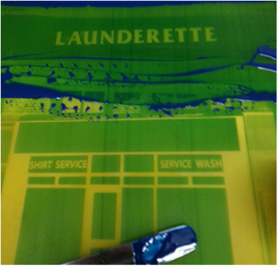
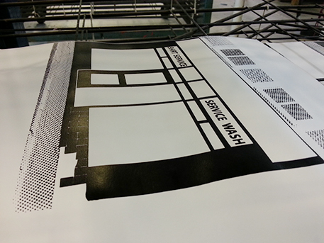
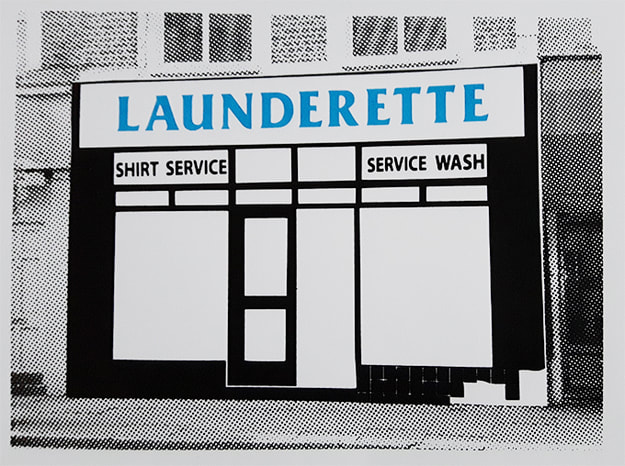 When our washing machine broke a few weeks ago I assumed we were pretty screwed for clean clothes. A few days in and beginning to stink, we turned to a launderette around the corner on Blackstock road. I had never actually been in a launderette and the experience jolted me into realising just how many are dotted around our neighbourhood. Launderettes somehow still stand as bastions against new wave coffee shops, wood-clad ramen restaurants and micro-brew pubs: they're part of the fabric of London life yet barely noticed amidst encroaching gentrification. 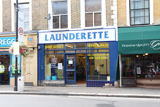 For this print I wanted to give some more longevity to the launderette that got me out of a pinch. Based on a few photographs, I re-drew the façade and used half-tones to create a confused, noisey background. The launderette gets centre stage here, with the London street around it depicted as transient and shifting. I've been working on a few prints of other Blackstock Road launderettes under this theme and click here for part 2 and part 3.
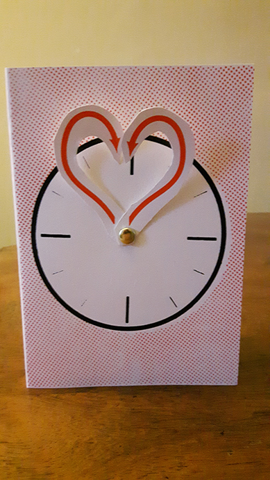
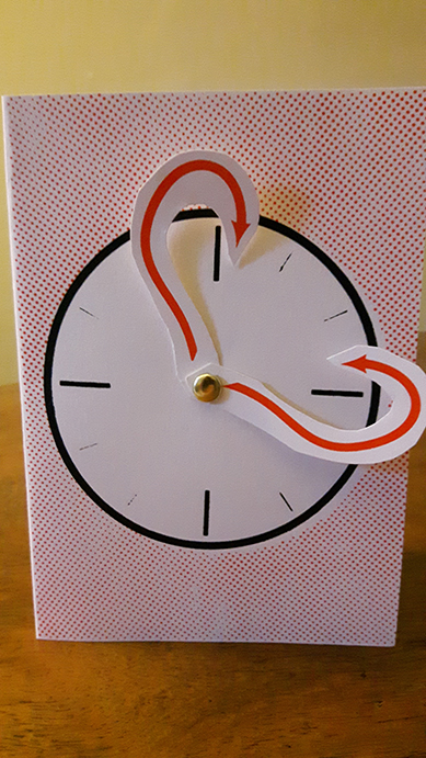
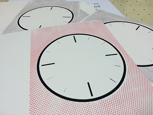
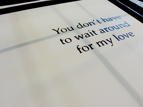
This birthday card accompanied a watch and I wanted to keep with the "time" theme. Mind you, no-one likes being reminded of the passing years, so I went for the message that love is timeless. The hands (also screen printed) rotate around a push-pin to make a heart, while inside features a quote from a musician that we saw live several times this year: Sweet Baboo.
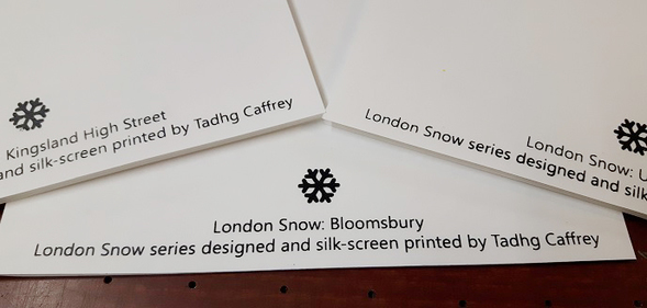 'Tis the season and all that so I've been working on a set of screen printed Christmas cards. I wanted to keep things minimal, and based on areas of London I've become familiar with this year: Upper Street in Islington, Kingsland Highstreet in Dalston and finally, Bloomsbury. Much of my art recently has been focussed on unusual architecture. For these cards, I aimed to represent landmarks from these areas in silhouettes, with some abstract snow flakes drifting upon the rooftops. For example, the Bloomsbury card features the Wilkins Building at University College London, the houses around Bedford Square and the Curzon cinema at the Brunswick Centre: 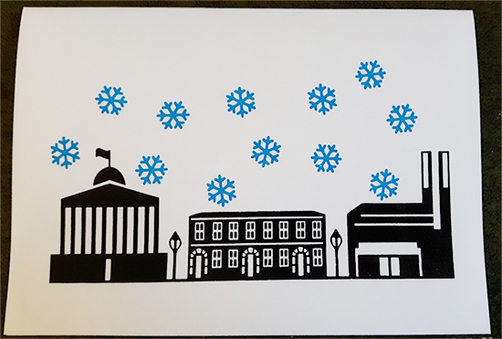 The finer detail, particularly on the houses in this card really pushed the limits of my screen and there was some blue air in the studio as I had initial trouble with ink smudging. Thankfully, with some good advice I rectified the issues (there was a lot of playing around with clamps, vices and screen bed heights) and completed the series on Friday. There are three street designs, each with two editions of different coloured snow flakes. Here's the Bloomsbury card again, this time in red, pre-folded and on the drying rack: 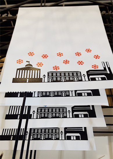 My Upper Street card has a few cafés, Union Chapel and Screen on the Green, while the Kingsland Highstreet card features Ridley Road Market, Kingsland shopping centre and the Rio cinema. Each has the series titled printed on the back.
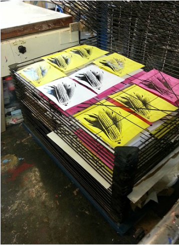
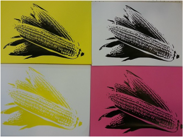
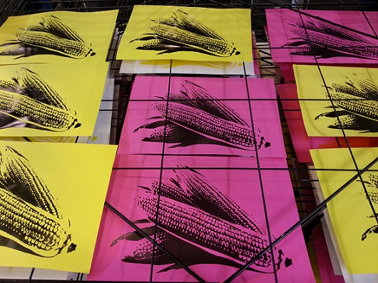
I'm hesitant to throw up lots of pictures of the series because I intend to actually send them to people and don't want to spoil the surprise: but if you insist, use the below slideshow to see the other designs! I'm also looking to sell some of these on the cheap to help cover my costs, so drop me a line if you're interested in a few blank ones. This was a fun print that I worked on a few weeks ago. I wanted something easy and recognisable, and I settled on a one layer print of some ears of corn. There were no grand ideas behind the print, I just wanted to focus on getting my technique right. As it was a one layer, I decided to give it the full space of my 90 thread mesh screen. 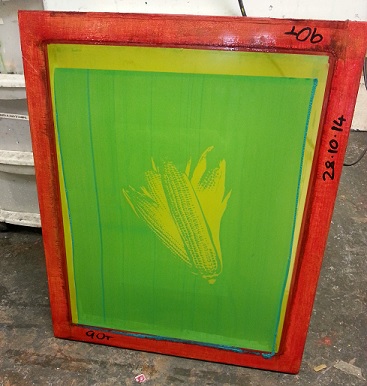 I messed around with a few inks and papers, mostly light weight stock and a few coloured backgrounds to go with it. It was a really simple and satisfying session in the studio, though it had me dying for a snack right after!
|