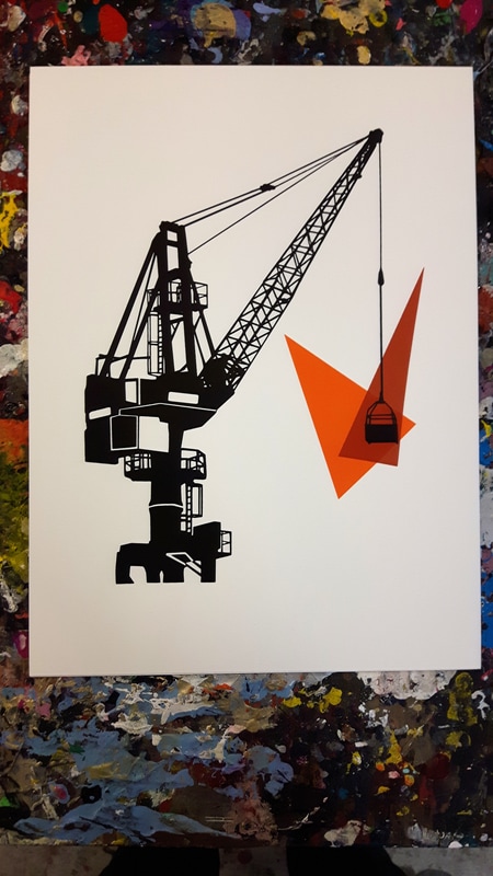
 This is the 7th (!) print of my current crane series, and it's continuing to spark lots of creativity and ideas for me. Like the previous crane, I used hand-cut shapes to create an abstract representation of construction, change and progress. This is a more stylised drawing of a crane from Gdansk and has sharper, thicker lines as a result.
0 Comments
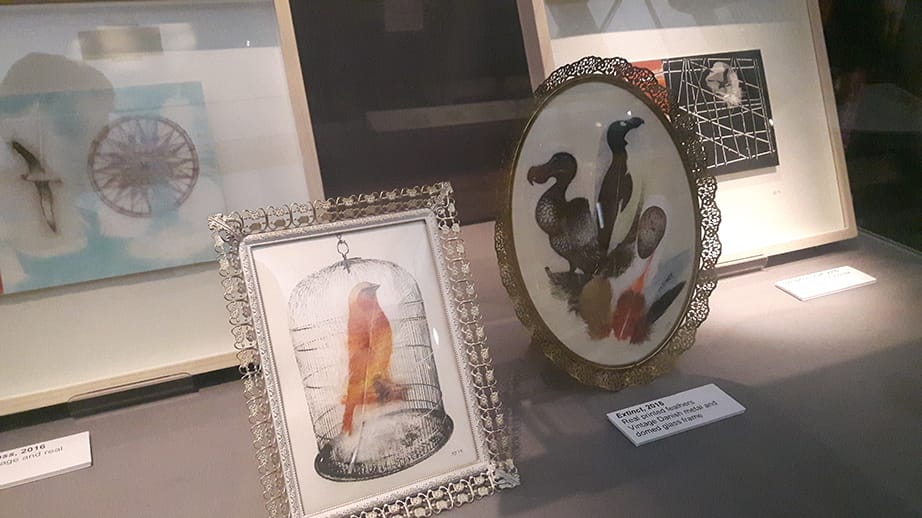
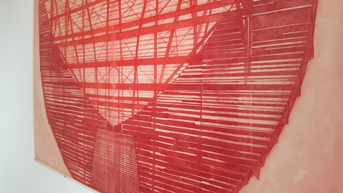
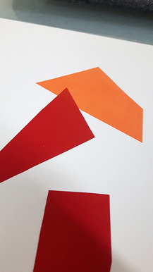
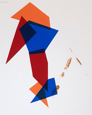
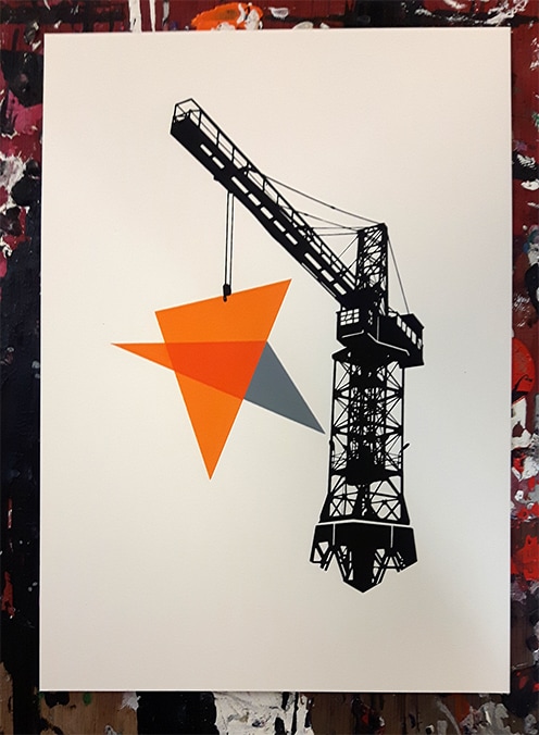 Crane #4 is a more abstract and stylised addition to the series. Rather than using more sketchy techniques, I've redrawn this crane and removed noise to give it a crisper look. The unique shape of this crane still grounds it in the Gdansk shipyards, but the stark contrast to the blank paper gives it a greater sense of abstraction. Arranging the handcut shapes for the load was a challenge and I focused on absolute precision with this print. Lining up these angles after creating them by hand was tricky, but I think rewarding and it furthers my study on block colours and shapes capturing our efforts to order the chaos of urban construction. 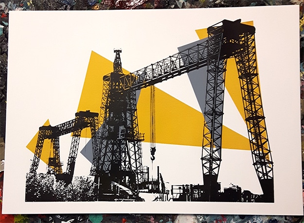 Crane #3 is based on some of the ship container cranes in Gdansk. I love these skeletal forms, like ancient monsters hulking over the landscape. Continuing my efforts to make every series of prints unique, I hand-cut the background stencils and arranged them by hand before exposing and printing. The shade of yellow took the most amount of work on this print, as it was important to keep it bright enough to foreground the cranes, yet dark enough to not look like bizarre spotlights. Keeping these shapes abstract has been a good vein to explore and I'm going to use them to continue to explore the disconnect of our expectations of urban landscape and the changes that are caused by construction equipment. 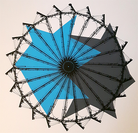 At the end of last year I was asked to curate a space as part of UCL Art Museum's Vault exhibition. It was a real pleasure working with the fantastic staff there and delving into the archive of work of the Slade School of Fine Art. I focused my cabinet on printmakers and brought together pieces from different decades in the 20th century to think about how mechanical reproduction of art works alongside the changing faces of urban life. In reaction to these pieces from various printmakers, including the master Eduardo Paolozzi, I created my own new piece. Crane #2 is based on a construction site in Bloomsbury, London. It rotates around an axis and is underpinned by abstract shapes which cut into each other. With this piece I attempted to capture a sense of the inevitability of change in the urban environment and how we as citizens and artists, attempt to force order upon this. I used hand-cut stencils for the piece along with the sharp, skeleton like image of the crane and, in doing so, I hope that I have brought into focus the contrast between the order we try to mentally impose on urban life and the reality that gentrification and the economy are the real masters of this space. This was a really satisfying project and I'm glad that the cabinet and my own contribution managed to spark a few thoughts and ideas, and brought together fascinating pieces from the Art Museum collection. I had the pleasure of visiting Newcastle back in October for the International Print Biennale. It was a real festival of print-making, with galleries across the city devoting their spaces to all sorts of printed material. This was a great opportunity to learn about different techniques and to submerge myself in the medium for a few days.  One of the things that struck me most while exploring the (approximately 10!) spaces I visited as part of the exhibition was the variety of ways that artists used print, it's constraints and possibilities to enhance their work and create new expressions. Rather than printing something for the sake of it, each of these artists actively engaged with the technical aspects of the medium and embedded the process into the creation of the piece. Printing onto feathers, using collage and embossing techniques (below) and combining different media gives printmaking a vibrancy that I had not seen so clearly before this visit. The city is also lovely and when you have galleries like the Baltic showing fantastic films from Lithuanian artist Deimantas Narkevičius it adds up to a pretty inspirational visit! Lots of thinking and experimentation for me on the horizon as I hope to incoporate what I've learnt on that fantastic art trip! 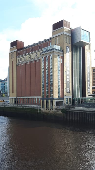 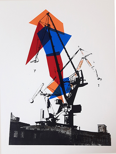 Crane #2 is based on some photographs I took this year in Gdańsk. It's a fantastic city and I really enjoyed exploring the shipyards and construction zones. For this print I wanted to combine hand-cut shapes and vectors to draw out some detail of the crane. I introduced these elements throughout the printing stages, changing the position and size of shapes and the opacity of inks as I completed each layer.
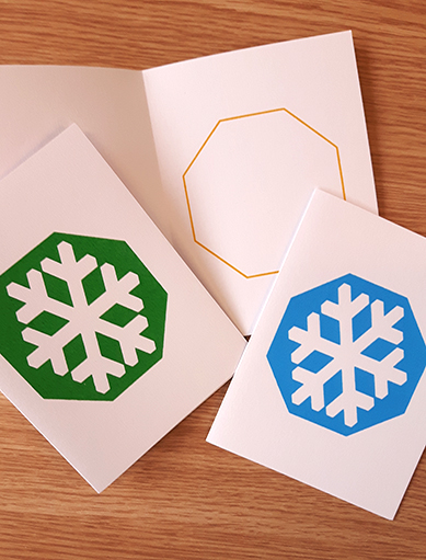
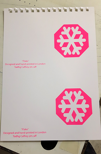
I also introduced hand-drawn elements, using a lithograph crayon to create spots of rust. This is something I'll be exploring in the future, as I'm increasingly interested in how printmaking can recreate construction materials and textures. I'm also thinking about how these personal, unique and handmade elements hint at the difference between the machinery that changes our city and the citizens who live in that city. I'm finding that the harsh, skeletal aesthetic of cranes and construction has an interesting counterpoint in the personalised, print-making process and I'm sure I'll be coming back to the creative goldmine of the Gdańsk shipyard soon! 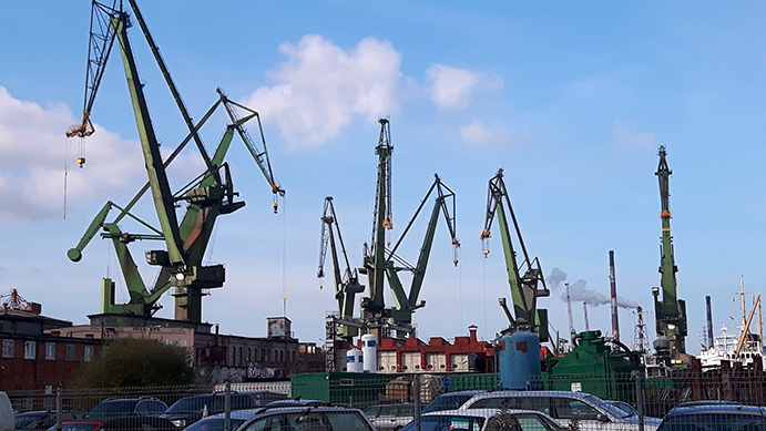 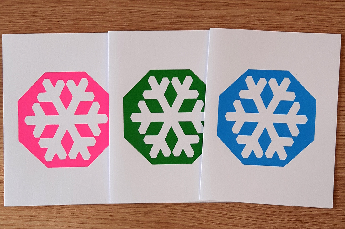 Apologies for the early mention, but I finished this year's Christmas Card design! It was fun putting together this negative image snowflake and felt like a great use of the graphics screen printing can create. I've gone for three colours, with a matte gold outline inside: all very geometrical. Couldn't resist going full on fluoro with the pink! The cards are on 300gsm, thick card with a slight texture and are sturdier than last year's. Like last year though, I have some extra stock if anyone would like to buy a few for the holidays. Drop me a line on email, DM or whatever if you're interested!
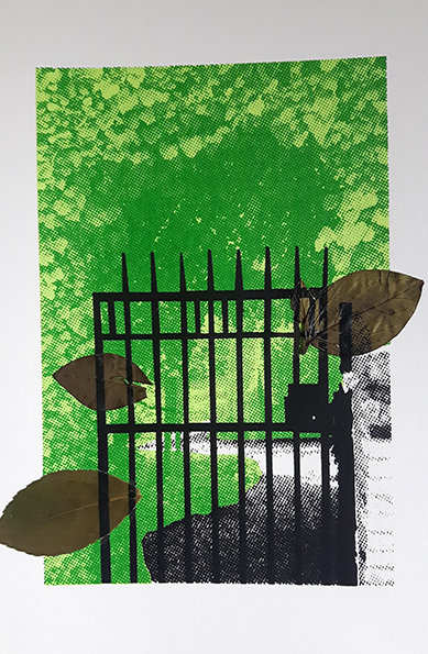
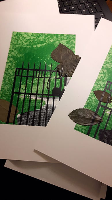
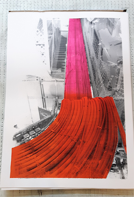 I visited the South East Combined Heat and Power station during Open House London this year and had a fantastic tour. The station generates electricity from refuse and I even got to pitch in and help operate some heavy machinery to contribute to their work. That simple act evoked thoughts of inter-connectivity and how the infrastructure created by stations like this silently and secretly connect us all together. I'm hoping to do a few prints based on the power station and to work around these ideas of energy through connection and networks and how these places passively influence urban life. 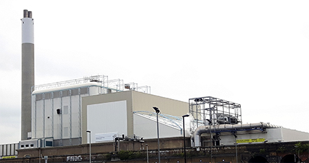 For this first print, I wanted to capture some of the energy coursing through industrial cables inside the plant: starting within the station and then fanning out throughout Deptford. I experimented with a split fountain: the process of blending inks together while in the process of printing. I tried this with a triple yellow/blue/red combination which had mixed results and an orange/pink version which was more successful. A black layer finished up the print, with a combination of line half-tones over the cables and dot half-tones for the background detail. Lots of experimentation in this print and lots to learn from as I refine the series. While trying to visit some of the gardens featured in my West London Gardens series, I decided to pinch a few leaves from each space and experiment them in my prints. I preserved some of the leaves using a glycerine solution (which I managed to spill everywhere!) and others by simply allowing them to dry while under a press. 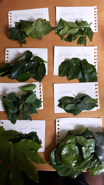 The first thing I wanted to try was incorporating the leaves into the garden prints. It felt appropriate to use actual leaves from the spaces on the prints, arching out of the piece as if to try and escape their imposed cage. I have five prints of Bramham Gardens that incorporated the leaves in this way.
Before committing these leaves to the page, I exposed them on my screen in an effort to permanently preserve some sense of them. Arranging the leaves on the exposure unit and the ensuing printing was a fluid process, without any real planning. I threw down a few layers and patterns as felt appropriate and I think they created some interesting prints. I also couldn't resist a few joke prints! 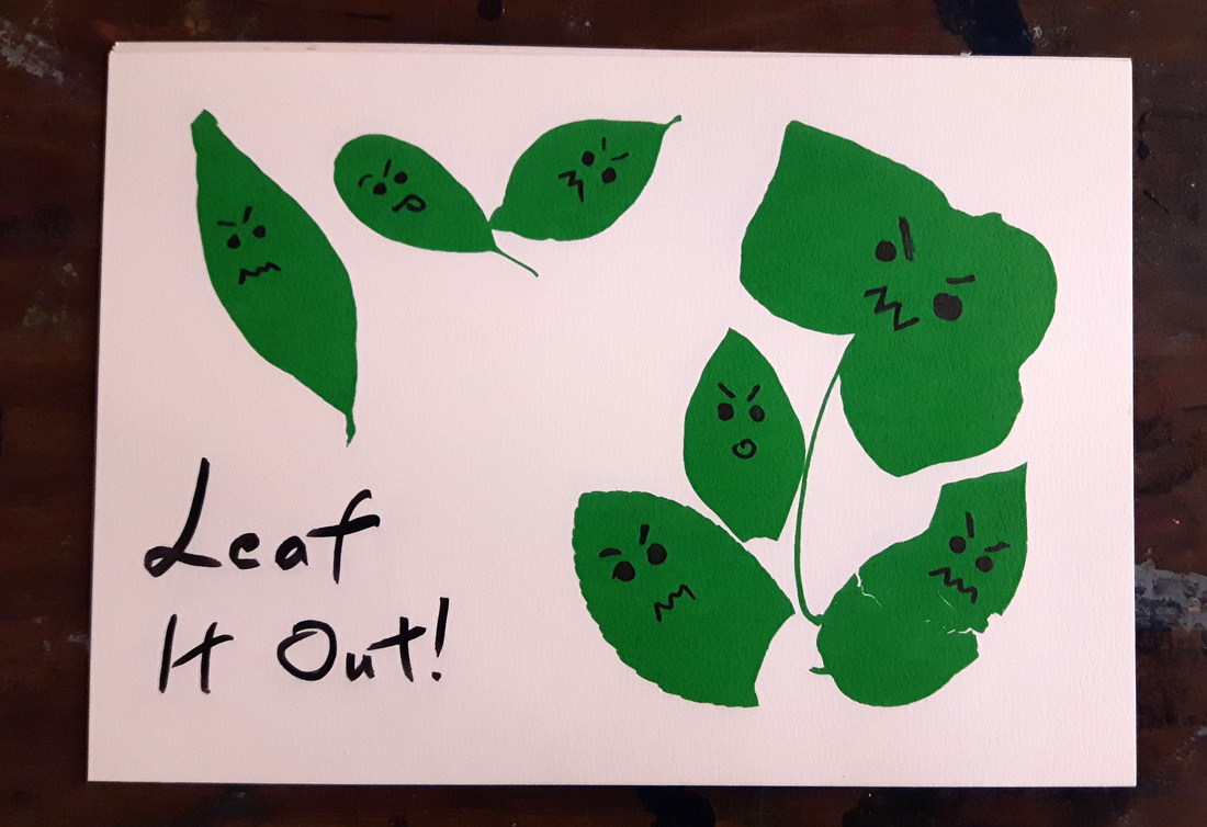 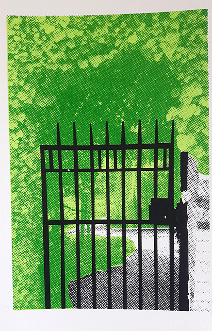 West London is littered with gorgeous garden spaces, most of which are enclosed behind wrought iron and preserved for those who can afford the astronomical cost of living in the area. I've always felt quite bitter about being locked out of these paradisaical spaces and so I've started a series trying to capture the tension of urban garden spaces and the commodification and gentrification of nature. This is Bramham Square, a lovely space (by the looks of it) with some fairly foreboding iron gates. This is a three layer print with the vibrant background halftones contrasting with the block black cage in the foreground. More to come on these prints, including some work with leaves I "liberated" from the gardens. |