|
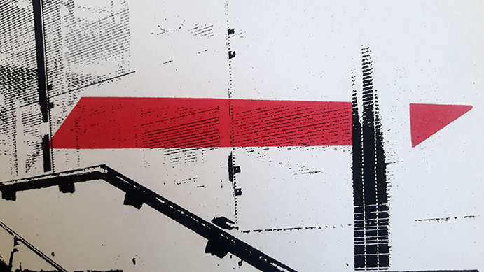
The second in my series of London junction boxes includes a half-toned background which gives it a slightly different context. With these prints I'm trying to develop a contrast between unfriendly, isolated rows of houses and their vivid, connected infrastructure. I've created numerous variants with this print, some with background and some without, some with sharp pinks and others with fluorescent green. They're all on A4 and are contributing to work on some larger pieces that I'm currently planning.
1 Comment
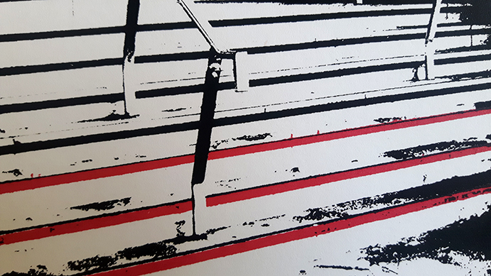
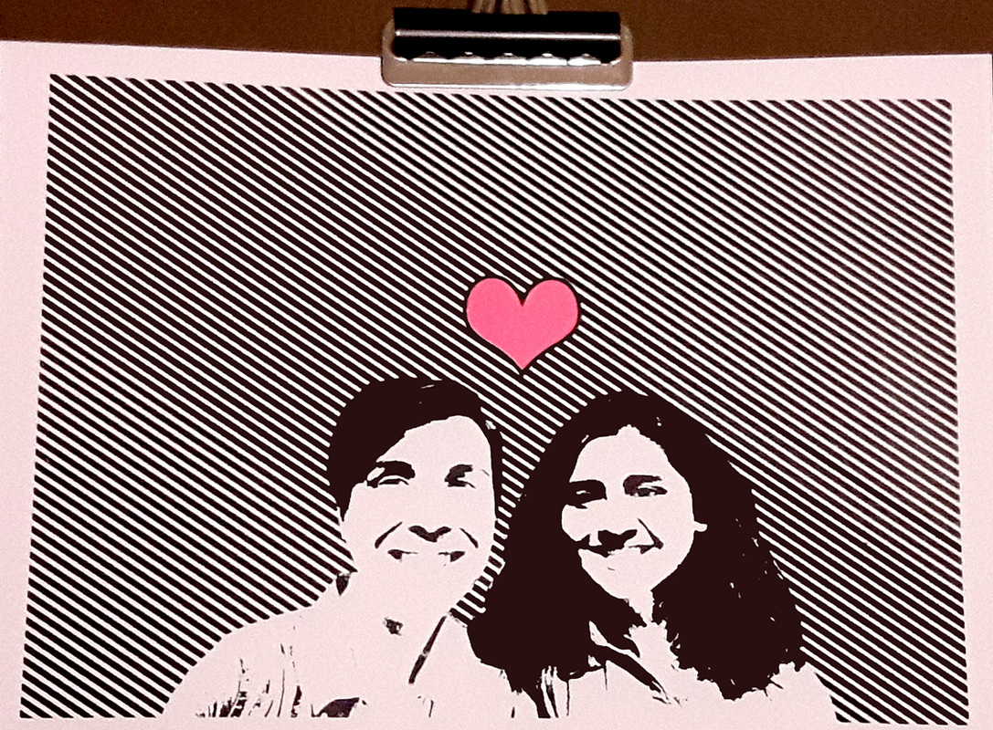 This two layer print was for a friend's wedding. The combination of line half-tones and thresholding was a fun contrast to work with. The small pink heart was a satisfying sign off to the print and we sent off a video of the production for them too. All the best to the happy couple! 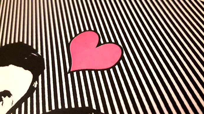 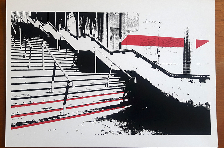 This staircase leads to the Arsenal football stadium. During match days, it's thronged with raucous fans. Usually though, it's quiet and cavernous, frequented by joggers and people like myself who take shortcuts via the stadium. This was a spark to consider how transitory places like public staircases can create contradicting experiences. The print is on A4 and is two layers, the second was as close to an Arsenal FC crimson I could get! 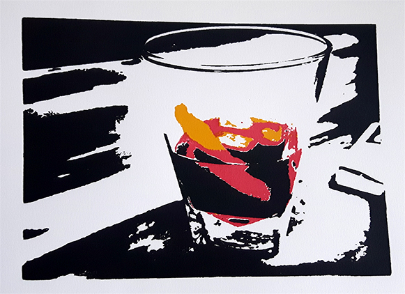 I've had a little break from the studio recently, having been on holiday and also needing to get some repairs done to some equipment. Happy to be back though and to celebrate I put together this print of an Old Fashioned cocktail. I'm no 'mixologist' but it isn't too tricky to get this cocktail right and it's been a nice after word wind-down during the summer. The print is three layers on A5 paper and I opted to use a crimson and mustard yellow to highlight the drink against the dark background which includes a window ledge and match box. Looking forward to continuing this Whisk(e)y series and more prints this summer! 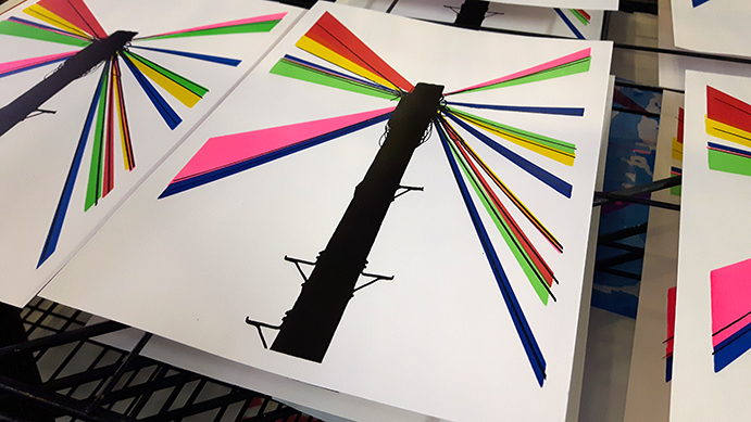 Junction boxes are a mess of cables, wire, wood and metal, linking houses together and pumping in TV, internet and electricity. In this print, shards of colour blast from the junction box, illuminating their role as beacons of modern, urban life. For this 6 layer print I kept the registration pretty free, allowing colours to overlap and influence the tone and hue of the final piece. I'm looking forward to experimenting with colours and designs similar to this in the next few weeks. 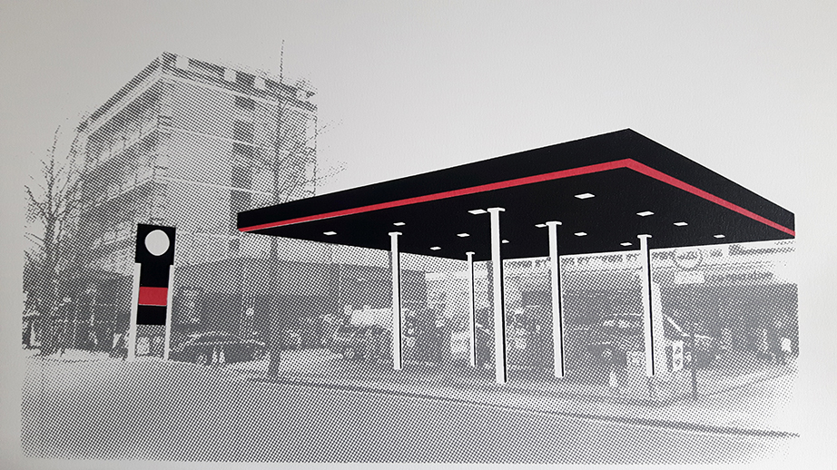 There's something unusual about petrol stations in major cities like London. Perhaps its their height - necessarily lower than all surrounding buildings for safety reasons - or their secret underground chambers coursing with fuel, or indeed, the fact that a modern city is one that should be striving towards a reduction in fossil fuel usage. London petrol stations are an anomaly, at odds with the city's green ambitions and rapid skyward expansion. For this print I wanted to highlight the weirdness of something we'd usually pass without considering. The grey half-tones of the background give the print a ghostly quality, questioning how long before these stations give-in to London's aesthetic and infrastructural changes. 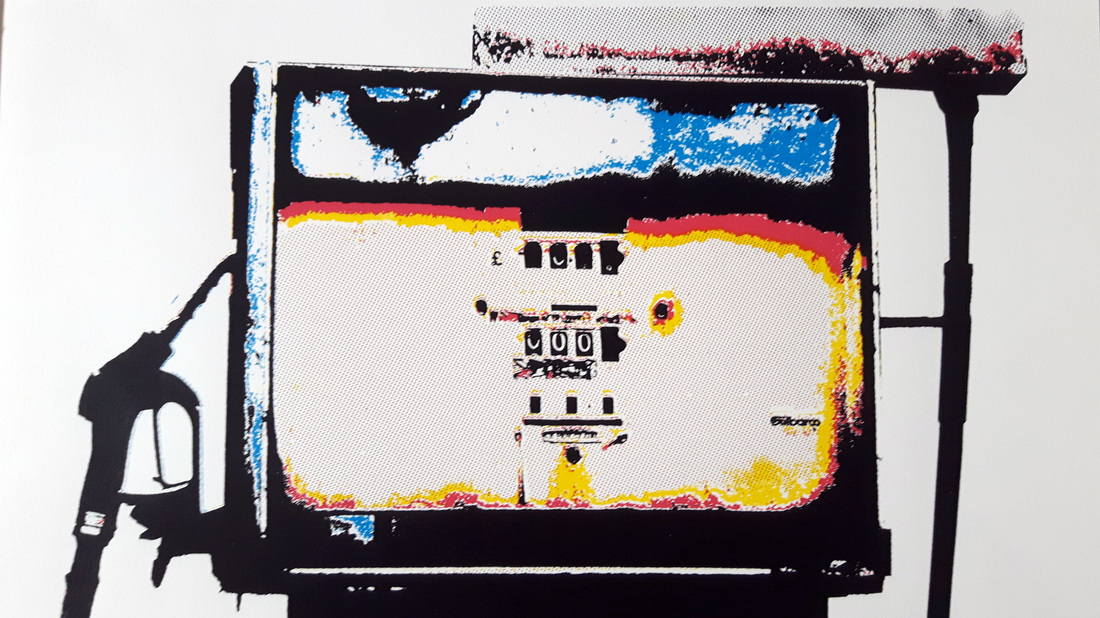 This is a 5 layer print based on a petrol pump found in an abandoned service station in East London. I've used CMYK (and orange!) to break down the contours of the pump and give it a rust-like quality. In the print, the fuel is corroding the pump from the inside and this is bleeding out through the stark colour layers. This was another tough layer to register and line-up and the detail is very fine, at times just a single pixel. As a result there are differences between each print, but I feel this adds to the edition and further highlights the degradation of the pump from pristine condition to rotting and useless. 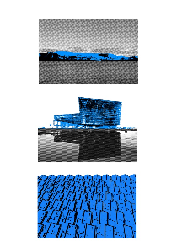 My friend Cat got in touch to see if I could work on a commission for her lovely fella Sam's birthday. They had recently been to Iceland and spent some time at Harpa, an astonishing music hall full of glass and concentric shapes. 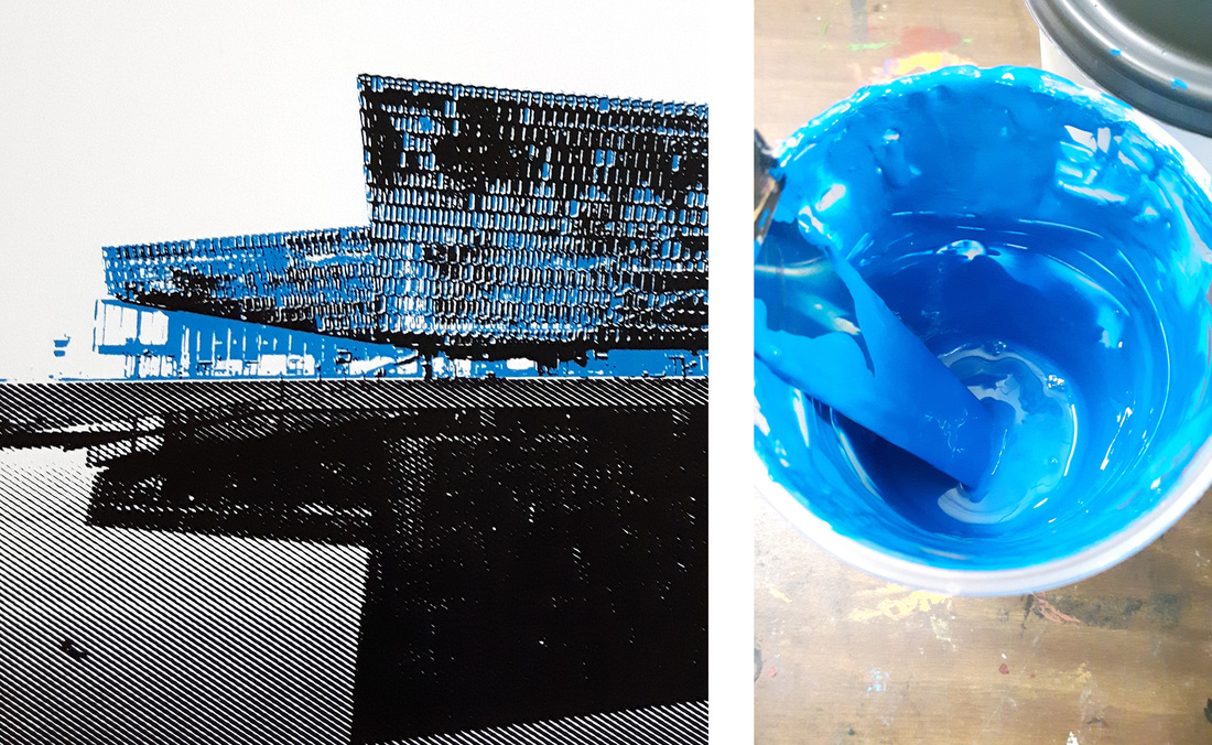 For this print I wanted to capture a sense of travelling to the building and its unique position within the austere Icelandic landscape. We decided on a triptych based on photographs and differing perspectives, with a combination of half-tones and vector art.
Fun print and fantastic building! 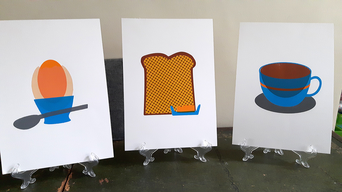 I've just finished up on the coffee cup as part of my breakfast triple! Each of the prints are four layers and it's been a fun experiment using transparent inks. I'm happy with how the colours tie the series together and glad I took this foray into pop art! 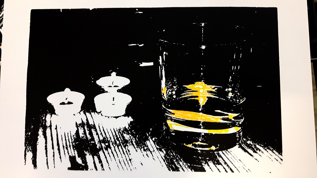 eWe had a lovely Easter spent in Scotland this year and with that, came a lovely bottle of Scotch. Springbank 10 was recommended by a knowledgeable Scot and didn't disappoint. This is a predominantly black print of a glass of Springbank, with yellow and orange highlighting the booze. This series of prints should give me a good excuse to dip into the whiskey collection! |